
I have many times commented with friends and acquaintances how impressive professional athletes are, what does it mean running a marathon in barely over 2 hours…
Many amateurs (not to mention sedentary people) would not keep up pace much longer than 100 metres. Each time I have made this comment to someone I had to verbally make some numbers for my interlocutor. I am sure these verbal calculations were not always well understood and digested. Following the adage “an image is worth more than a thousand words”:
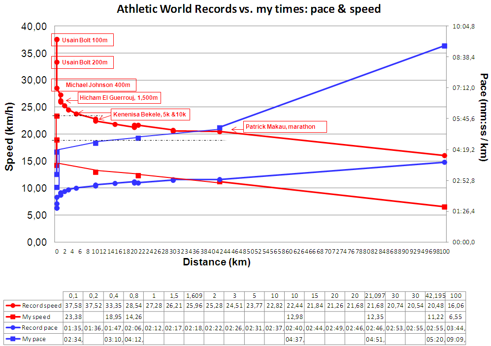
Athletics World Records vs. my times
Red lines show speed (in km/h; decreasing as race distances get longer). Blue lines show pace (in mm:ss / km; increasing as race distances get longer). I have included a table so you can compare the numbers.
I took athletics world records from the Wikipedia. You can find my times in the page “Races” of this blog. I only added a tag to the records that most of you will recognise, as they were achieved by well-known super stars.
There are many catches in the graphic. Two impress me the most:
- I could have kept up the pace of Patrick Makau in his marathon world-record-beating performance for 100 metres… but not for 400m! (see black dotted lines).
- How once we enter into aerobic exercise, we’re able to almost keep up speed despite distance increases. The difference in speeds between Bekele’s 5k (23.77 km/h) and Makau’s marathon (20.48 km/h) is only 3.25 km/h!
***
NOTE: I am not a particularly fast runner, thus don’t take the times and paces and interpret them as if no amateur runner could keep up pace for more than 100m… some will keep it up somewhat longer. I just wanted to share the idea.


For a slightly clearer picture I would plot over logarithmic distance.
Hi Uwe,
Thanks for your comment. It’s true that the logarithmic plot would provide a better view of the decrease in speed between 100m and 5k, I may plot that. However, I also wanted to show how runners can almost keep for 42k a speed close to that of a 5k. That would not be well appreciated in a log plot.
Good Morning Javier,
quite the contrary imho.
you would get a falling straight line segment for the energy limited dash range and a further strait segment of less inclination for the “fuel feed” limited cruise ranges. joined by a distinct turning point that moves left|right depending on energy release capabilities i.e. training .
Would be interesting to know the long range values for sprinters and vice versa as a comparison. The long distance sustainer runners aren’t all that good at sprint afaik.
Just tested. this gives 4 distinct segments
1 max energy release sprint : 100m,200m
2 constant energy release : 400m, 800m
3 sustainer 2km … 42km
4 depletion 42km onwards.not enough values to show turning point.
I did the test as well. Curious result, yes. Another way to look at it. Thanks for the idea. Will post it.
Pingback: Athletic World Records vs. my times (speed vs. distance in log plot) | The Blog by Javier