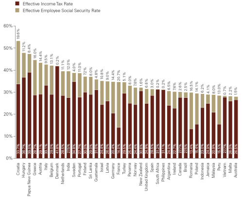
A friend posted in Facebook yesterday’s Daily chart from The Economist; she was very disappointed of finding Hungary such high in the ranking.
The chart comes from KPMG’s “Individual Income Tax and Social Security Rate Survey 2010”. I found it very interesting:
- it contains several charts of rates of income tax and social security rates for different levels of income (high ones by the way),
- coloured maps of the different regions in the world according to their level of taxation,
- for some countries you may find graphics with the evolution of taxation levels with income,
- capital gains tax, and
- some country-specific information for several ones.
What if you could pay Social Security in Philippines (0.2%) and Income Tax in Romania (13.4%)?


