Yesterday, the Aviation Safety Network released the 2018 airliner accident statistics showing a total of 15 fatal airliner accidents, resulting in 556 fatalities.
Aviation Safety Network is a private initiative from the Flight Safety Foundation which curates an extensive database with aviation incidents, hijackings and accidents, from 1946 to nowadays.
The tweet with which they made the announcement is below:
Which includes the graphic below.

If we take a quick look at the figures (which report commercial aviation flights (passenger and cargo)):
- Number of accidents: 15, up from 10 in 2017, though still the 3rd safest year in history.
- Fatalities: 556, up from 44 in 2017, the 9th safest year in history.
- There were a few accidents with large number of fatalities (details here).
The graphic above from the Aviation Safety Network provides the view of the evolution of accidents. However, in their database they provide some more figures with which I produced some graphics.
Evolution of accidents per million flights
The database provides figures of the evolution of the number of world air departures since 1970, together with the evolution of accidents (above). The database includes a ratio: fatal accidents per million flights, which I have plotted below together with the evolution of flight departures. You can see that the ratio has decreased 16 fold since 1970, from 6.35 to 0.39 last year.

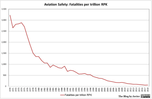
Global air traffic vs fatalities
The database provides no ratio with the figures of fatalities, but they can be related to the amount of passengers carried. In aviation there is the concept of revenue passenger kilometre (RPK) transported, which is compiled year by year and can be found in publications from ICAO, IATA or aircraft manufacturers. I have plotted below both the evolution of traffic growth and fatalities since 1970, together with a 5-year moving average for the fatalities.
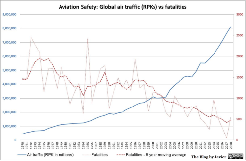
Within the evolution of traffic there are two variables that have grown over the years: the number of passengers carried per flight departure and the distance covered. Therefore, together with the decrease in the evolution of fatalities (taking the 5 year average) I have plotted below the evolution of the ratio of fatalities per trillion RPK. You can see that the ratio has decreased 54 fold since 1970, from 3,218 to 59 last year (5-year average).