Tag Archives: evolution

Marathon world record evolution (2025)

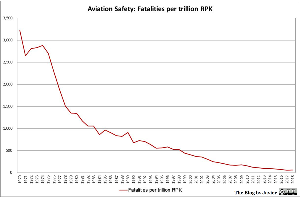
Last time I checked all-time men’s best marathon times and the world record evolution was in 2014 ahead of running Rotterdam marathon (post back then). In this blog post I’m going to make an update, share some charts and review some statistics. For that purpose, I use the website “Track and Field all-time Performances” (maintained since years ago by Peter Larsson).

With the data of all-time best men’s marathon I plotted the chart below with the best 1,903 times, i.e., all those below 2h08′ and their dates, highlighting marathon times by Haile Gebrselassie, Wilson Kipsang, Eliud Kipchoge, Kenenisa Bekele and Kelvin Kiptum.

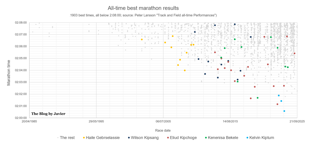
Some stats in relation to those 1,903 times under 2h08′:

  • Countries of which athletes achieved most such times: Kenya 853 times or 44.8%, Ethiopia 570 times or 30.0%, Japan 114 (6.0%), Morocco 44 (2.3%), Eritrea 41 (2.2%), Israel 20 (1.1%), France 20 (1.1%), Uganda 19 (1.0%). Those are the top 9 countries, there are another 34 from which athletes have run below 2h08′ (for a total of 43 countries).
  • There are 742 athletes that have run below 2h08′. The individuals who have done so more often: Eliud Kipchoge 18 times, Sisay Lemma 17, Tsegay Kebede 15, Tamirat Tola 13, Abel Kirui 13, Wilson Kipsang 12, Bernard Kiprop 12, Evans Chebet 12, Benson Kipruto 12, Laban Korir 11, Emmanuel Mutai 11, Amos Kipruto 11, Birhanu Legese 11, Kenenisa Bekele 10, Haile Gebrselassie 10, Leul Gebrselassie 10, Deso Gelmisa 10…

Now, if we raise the bar to see the times at or below 2h05′, we find 231 times:

  • Countries of which athletes achieved most such times: Kenya 108 times or 46.8%, Ethiopia 98 times or 42.4% (both combined 89.2%!), Tanzania 4 (1.7%), Belgium 4 (1.7%), Netherlands 3 (1.3%). Those are the top 5 countries, there are another 11 from which athletes have run at or below 2h05′ (for a total of 16 countries).
  • There are 124 athletes that have run at or below 2h05′. The individuals who have done so more often: Eliud Kipchoge 14 times, Tamirat Tola 8, Wilson Kipsang 8, Sisay Lemma 7, Amos Kipruto 6, Birhanu Legese 6, Leul Gebrselassie 5, three athletes with 4 times including Kenenisa Bekele, 14 athletes with 3 times including Kelvin Kiptum, Dennis Kimetto, Geoffrey Mutai and Haile Gebrselassie, 23 athletes with 2 times including Patrick Makau…
  • Which are the fastest marathons? The cities where most of those 231 times at or below 2h05′ have been achieved are: Berlin and Valencia with 35 each, London and Dubai with 27 each, Rotterdam 18, Amsterdam and Chicago with 15 each, Tokyo 14. Those are the top 8 cities (accounting for 81% of those 231 times), there are other 16 cities where such fast times have been achieved.

Now let’s look at the evolution of the World Record since 1985 in this other chart:

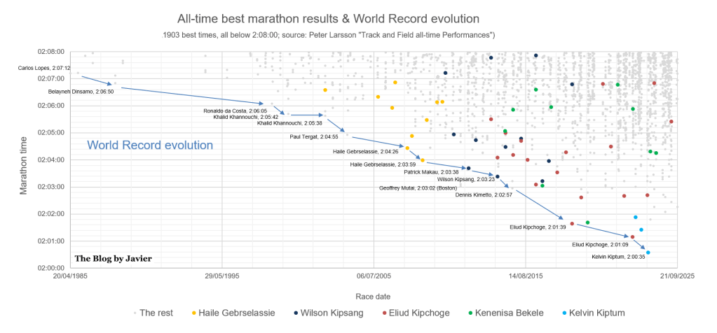
Some comments to the chart:

  • In the last 40 years, the record has been beaten 13 times.
  • The current world record was set by Kelvin Kiptum in Chicago in 2023 with 2h00’35” at the age of 23.9. He sadly passed away in a car crash a few months later. His career was very promising, having run only 3 marathons, all three in less than 12 months, all 3 below 2h02′. 3 of the best 7 times, 1 of the only 4 men having run below that mark.
  • The record that lasted the most was Dinsamo’s 2:06:50 in 1988, which took just over 10 years to be beaten by Ronaldo da Costa in 1998.
  • 3 athletes have set the world record twice: Khalid Khannouchi, Haile Gebrselassie and Eliud Kipchoge.
  • The biggest improvement of the record was made by Eliud Kipchoge who took 1’18” off Dennis Kimetto’s previous record.
  • Geoffrey Mutai ran in 2h03’02” before 3 world records set the bar below his time, however, as he achieved that in Boston 2011 (downhill and point to point race) it didn’t count for the record.

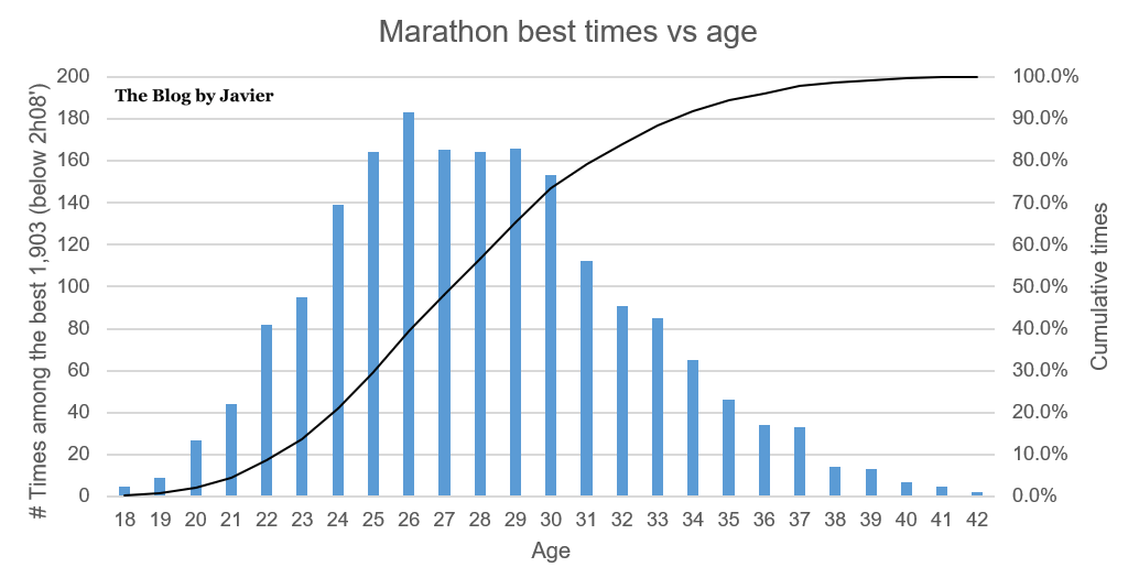
What is the best age to run marathons?

I plotted this other chart looking at the best 1,903 marathon times vs the age the runners had at the time of completing each of those races.

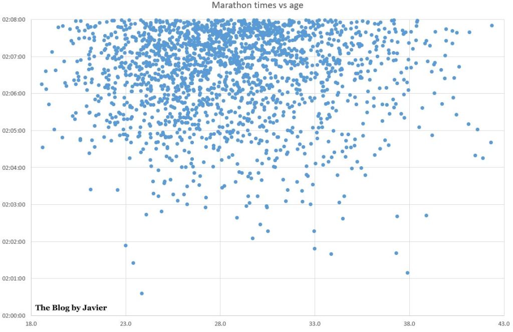
Most of the times below 2h08′ are achieved between 23 and 33 years old, but indeed most of the best ones are achieved between 28 and 39 years old, with the exception of the 3 marathons ran by Kelvin Kiptum, including his current world record.

Another interesting chart to relate best times and age is the histogram below. In that one we can see that effectively most of the times below 2h08′ are achieved between 24 and 30 years old, and between 23 and 33 (both included) 80% of those times are achieved.

Leave a comment

Filed under Sports

Aviation safety evolution (2019 update)

Yesterday, the Aviation Safety Network released the 2019 airliner accident statistics showing a total of 20 fatal airliner accidents, resulting in 283 fatalities.

Aviation Safety Network is a private initiative from the Flight Safety Foundation which curates an extensive database with aviation incidents, hijackings and accidents, from 1946 to nowadays.

The tweet with which they made the announcement is below:

Which includes the graphic below.

ASN_infographic_2019

If we take a quick look at the figures (which report commercial aviation flights (passenger and cargo)):

  • Number of accidents: 20, up from 15 in 2020, though still the 7th safest year in history (in number of accidents).
  • Fatalities: 283, down from 556 in 2018, the 3rd safest year in history (in number of fatalities).
  • There were 5 accidents with over 10 fatalities (details here).

The graphic above from the Aviation Safety Network provides the view of the evolution of accidents. However, in their database they provide some more figures with which I produced the graphics below.

Evolution of accidents per million flights

The database provides figures of the evolution of the number of world air departures since 1970, together with the evolution of accidents (above). The database includes a ratio: fatal accidents per million flights, which I have plotted below together with the evolution of flight departures. You can see that the ratio has decreased 12 fold since 1970, from 6.35 to 0.51 last year.

2019_safety_accidents_per_flights


Global air traffic vs fatalities

The database provides no ratio with the figures of fatalities, but they can be related to the amount of passengers carried. In aviation there is the concept of revenue passenger kilometre (RPK) transported, which is compiled year by year and can be found in publications from ICAOIATA or aircraft manufacturers. I have plotted below both the evolution of traffic growth and fatalities since 1970, together with a 5-year moving average for the fatalities.

2019_safety_RPK_vs_fatalities

Within the evolution of traffic there are two variables that have grown over the years: the number of passengers carried per flight departure and the distance covered. Therefore, together with the decrease in the evolution of fatalities (taking the 5 year average) I have plotted below the evolution of the ratio of fatalities per trillion RPK. You can see that the ratio has decreased 81 fold since 1970, from 3,218 to 40 last year (5-year average).

2019_safety_fatalities_per_RPK

5 Comments

Filed under Aerospace & Defence

Aviation safety evolution (2018 update)

Yesterday, the Aviation Safety Network released the 2018 airliner accident statistics showing a total of 15 fatal airliner accidents, resulting in 556 fatalities.

Aviation Safety Network is a private initiative from the Flight Safety Foundation which curates an extensive database with aviation incidents, hijackings and accidents, from 1946 to nowadays.

The tweet with which they made the announcement is below:

Which includes the graphic below.

ASN_infographic_2018.

If we take a quick look at the figures (which report commercial aviation flights (passenger and cargo)):

  • Number of accidents: 15, up from 10 in 2017, though still the 3rd safest year in history.
  • Fatalities: 556, up from 44 in 2017, the 9th safest year in history.
  • There were a few accidents with large number of fatalities (details here).

The graphic above from the Aviation Safety Network provides the view of the evolution of accidents. However, in their database they provide some more figures with which I produced some graphics.

Evolution of accidents per million flights

The database provides figures of the evolution of the number of world air departures since 1970, together with the evolution of accidents (above). The database includes a ratio: fatal accidents per million flights, which I have plotted below together with the evolution of flight departures. You can see that the ratio has decreased 16 fold since 1970, from 6.35 to 0.39 last year.

2018_safety_accidents_per_flights

Global air traffic vs fatalities

The database provides no ratio with the figures of fatalities, but they can be related to the amount of passengers carried. In aviation there is the concept of revenue passenger kilometre (RPK) transported, which is compiled year by year and can be found in publications from ICAO, IATA or aircraft manufacturers. I have plotted below both the evolution of traffic growth and fatalities since 1970, together with a 5-year moving average for the fatalities.

2018_safety_RPK_vs_fatalities

Within the evolution of traffic there are two variables that have grown over the years: the number of passengers carried per flight departure and the distance covered. Therefore, together with the decrease in the evolution of fatalities (taking the 5 year average) I have plotted below the evolution of the ratio of fatalities per trillion RPK. You can see that the ratio has decreased 54 fold since 1970, from 3,218 to 59 last year (5-year average).

2018_safety_fatalities_per_RPK

Leave a comment

Filed under Aerospace & Defence