
Yesterday, the Aviation Safety Network released the 2019 airliner accident statistics showing a total of 20 fatal airliner accidents, resulting in 283 fatalities.
Aviation Safety Network is a private initiative from the Flight Safety Foundation which curates an extensive database with aviation incidents, hijackings and accidents, from 1946 to nowadays.
The tweet with which they made the announcement is below:
Which includes the graphic below.

If we take a quick look at the figures (which report commercial aviation flights (passenger and cargo)):
- Number of accidents: 20, up from 15 in 2020, though still the 7th safest year in history (in number of accidents).
- Fatalities: 283, down from 556 in 2018, the 3rd safest year in history (in number of fatalities).
- There were 5 accidents with over 10 fatalities (details here).
The graphic above from the Aviation Safety Network provides the view of the evolution of accidents. However, in their database they provide some more figures with which I produced the graphics below.
Evolution of accidents per million flights
The database provides figures of the evolution of the number of world air departures since 1970, together with the evolution of accidents (above). The database includes a ratio: fatal accidents per million flights, which I have plotted below together with the evolution of flight departures. You can see that the ratio has decreased 12 fold since 1970, from 6.35 to 0.51 last year.

Global air traffic vs fatalities
The database provides no ratio with the figures of fatalities, but they can be related to the amount of passengers carried. In aviation there is the concept of revenue passenger kilometre (RPK) transported, which is compiled year by year and can be found in publications from ICAO, IATA or aircraft manufacturers. I have plotted below both the evolution of traffic growth and fatalities since 1970, together with a 5-year moving average for the fatalities.

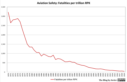
Within the evolution of traffic there are two variables that have grown over the years: the number of passengers carried per flight departure and the distance covered. Therefore, together with the decrease in the evolution of fatalities (taking the 5 year average) I have plotted below the evolution of the ratio of fatalities per trillion RPK. You can see that the ratio has decreased 81 fold since 1970, from 3,218 to 40 last year (5-year average).


IMHO plotting should be done with y-axis in logscale to properly show the developement. I love logscale :-))
I have plotted it in the spreadsheet with log scale. In my opinion it shows better the variations in the past few years (near term) but it doesn’t show that well the impressive improvement along the decades coupled with the increase in flights and RPK.
by effort the past was not more impressive than recent history.
it is an asymtotic problem. The real effort is in differential change per interval.
If the logscale curve “flattens out” we’ve lost leverage on progress.
The linear graph flattening out is to be expected.
( You’ never cross into the negative and resurrect people, you won’t even be able to touch “Y=0” 🙂
Pingback: Progress On A Technical Solution For Aviation Safety And 5G In Time For Christmas
Pingback: The Abundance of Air Travel Since 1970 | Economics