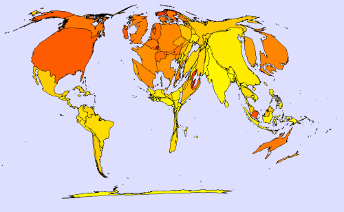
At work I often use different lists of countries by aircraft fleets, GDP, military expenditure, etc. Sometime ago I thought that it would be interesting to produce those kind of maps in which the area of the country represents the value of a variable: cartograms. Surfing through the internet you may find different websites with lots of cartograms to download, explanations about the method to produce them and even some applications that you may use to produce your own cartogram.
Today I have been playing with one of these applications. These are three of the cartograms I made:
- In the first one: area represents GDP (in purchasing power parity) whereas colour shows GDP per capita (again in PPP).
- The second one shows: military expenditure (PPP) as the area of countries whereas colour shows military expenditure as a percentage of GDP.
- The last one has area representing again military expenditure (PPP) and colour showing military expenditure per capita (PPP).
The data I used comes from extractions I made from the CIA World FactBook in 2007-2008, which used estimated data of different years, mainly 2006.
The application I used is made by MAPresso, and the quickest explanation on how to work with it I found it in this blog.


Why is Antarctica depicted on the first map as having higher GDP than Ireland?