Tag Archives: Purchasing Power Parity

Big Mac in Aswan

While in Aswan, Egypt, I went to a McDonald’s restaurant. When I finished my meal I went to the counter to ask “What is the price of a single Big Mac?”, “16.5 Egyptian pounds”.

I wanted to check The Economist‘s Big Mac index, their exchange-rate scorecard (see a detailed explanation), for the case of Egypt.

Already in the last list published it can be seen that they used a 13.0 pound price, while I was given 16.5 pound (probably because I went to a more touristic McD restaurant than the average). At the time of writing the post the exchange rate is: 1 E£ = 0.1726 US$.

The reference is always the price of the hamburger in USA (average of Atlanta, Chicago, New York and San Francisco), which in the latest publication of the index was 3.73$.

The dollar cost at the exchange rate of the hamburger was 2.848$; according to that, the Egyptian pound is 24% undervalued against the dollar (in relation to Aswan prices). The Economist normally calculates as well the implied purchasing power parity of the dollar: 4.42 (=16.5/3.73) while the actual exchange rate was 5.79 (=1/0.1726).

Finally, I wanted to remark 3 other things that caught my attention in the restaurant:

  • They had an employee of the month award and published it.
  • The uniform of the global company made local.
  • They provided delivery service… I wish they did that in Europe.

1 Comment

Filed under Economy, Travelling

A different view of the World

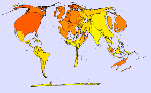
At work I often use different lists of countries by aircraft fleets, GDP, military expenditure, etc. Sometime ago I thought that it would be interesting to produce those kind of maps in which the area of the country represents the value of a variable: cartograms. Surfing through the internet you may find different websites with lots of cartograms to download, explanations about the method to produce them and even some applications that you may use to produce your own cartogram.

Today I have been playing with one of these applications. These are three of the cartograms I made:

  • In the first one: area represents GDP (in purchasing power parity) whereas colour shows GDP per capita (again in PPP).
  • The second one shows: military expenditure (PPP) as the area of countries whereas colour shows military expenditure as a percentage of GDP.
  • The last one has area representing again military expenditure (PPP) and colour showing military expenditure per capita (PPP).

Area showing GDP (PPP); colour showing GDP per capita (PPP).

Area showing Military Expenditure (PPP); colour showing Military Expenditure as percentage of GDP.

Area showing Military Expenditure (PPP); colour showing Military Expenditure per capita (PPP).

The data I used comes from extractions I made from the CIA World FactBook in 2007-2008, which used estimated data of different years, mainly 2006.

The application I used is made by MAPresso, and the quickest explanation on how to work with it I found it in this blog.

1 Comment

Filed under Aerospace & Defence