Tag Archives: GDP

2016 Olympic Games medal table vs. population and GDP

Now that the 2016 Olympic Games of Rio de Janeiro have finished, I wanted to update and share here in the blog a couple of tables I produced a few days ago comparing the medal count per country and the ratios of such medal count in relation to the population and the size of the economy of each country.

To start with, find here the official medal count, which is ordered taking into account which national olympic committee has obtained the most gold medals, then most silver medals and finally most bronze medals (and not by the total tally).

Rio 2016 - medal table 2016.08.21

In the table I have only included the top 20 countries, but you can find here the complete list. There are 86 nations that have collected medals in the Games. This means that over a hundred nations have not collected a single medal.

Without doubt the most dominant nation in the Olympics has been the United States with 121 medals won, 46 of them of gold. That is over 50 more medals than China or the United Kingdom.

However, the United States has a population of about 5 times that of the United Kingdom, therefore the pool of talent where to search for olympians is much larger. This allows me to introduce the first ratio: Population / medal. I collected the figures of population from the Wikipedia (here). Find a table below with the results:

Rio 2016 - ratio population medal table 2016.08.21 selection

The table shows a selection of 44 countries not the complete list of 86. Find such complete list at the bottom of the post and find your country. These 44 countries help me to make the following remarks:

  • Small nations such as Grenada and Bahamas, despite of having collected only 1-2 medals lead the table.
  • In the top 20 we find nations such as New Zealand, Denmark, Australia, Netherlands and Sweden that tend to be in the lead pack of any positive ranking. They seem to be good as well in producing olympian talent.
  • The 4 bigger European Union nations find themselves in the upper third of the list, with between 1 and 2 million inhabitants per medal, with the UK leading the pack followed by France, Germany and Italy.
  • United States for all its dominance in the medal table is only the 43rd nation taking into account the size of its population. That is at the middle of the table. One would say that the average American doesn’t play any better at sports but the sheer size of the country allows it to find plenty of good olympians in different sports.
  • Funny enough, just above the USA we find Russia in this ranking. And just below, Spain. All 3 have about 1 medal for every 2.7 million inhabitants.
  • At the bottom of the table we find large nations such as India, Nigeria, Philippines or Indonesia that with over 100 million inhabitants have also collected only between 1-3 medals each.
  • Plenty of nations have not managed to collect a single medal, some of them large nations: Pakistan (~194 million inhabitants), Bangladesh (~160 m). Most African countries have not won a medal as many in the Middle East (e.g. Saudi Arabia). Some emerging nations from Latin America neither: Chile, Peru, Uruguay

As there are few developed countries at the bottom of the list I thought of producing a similar ranking but with the ratio “gross domestic product (GDP)” / medal. The guiding thought is that the larger the size of the economy of a given country the more resources it will have to recruit sportive talent, to train it, to send it to international competitions, to build sport infrastructures, etc. (1) (2) I collected the figures of GDP from the Wikipedia (here; the source for most of the figures is the International Monetary Fund whereas for about 5 of them is the World Bank). Find a table below with the results:

Rio 2016 - ratio nominal GDP medal table 2016.08.21 selection

The table shows a similar selection of ~45 countries not the complete list of 86. Find such complete list at the bottom of the post and find your country. These countries help me to make the following remarks:

  • Among the top 30 nations all are small economies. The first G20 economy we find is Russia in the 34th position. These small economies leading the table translate between 1 bn$ and 20 bn$ of GDP per medal.
  • We find Grenada, Jamaica and Bahamas in top 10 in both rankings.
  • African nations that do well in athletics show up here: Kenya (12th) and Ethiopia (24th).
  • Where are New Zealand, Denmark, Australia, Netherlands and Sweden in this ranking? They are between the 25th (New Zealand) and the 48th (Sweden) positions, converting between 9 bn$ and 46 bn$ of GDP into a medal.
  • Where are the 4 bigger European Union nations in this ranking? They are between the 44th (United Kingdom) and the 60th (Germany) positions, converting between 41 bn$ and 82 bn$ of GDP into a medal. That is at the second half of the ranking.
  • Where is the USA? At the bottom of the pack, in the 73rd position just followed by China. Both translating between 152 – 162 bn$ of GDP into a medal. That is an economy about the size of New Zealand (4.7 million inhabitants).
  • We find the richest economies of the Middle East (Qatar and United Arab Emirates) at the bottom of the table, not being able to translate petrodollars into medals, despite of signing some good athletes.
  • At the bottom of the table we find some of the same large nations: India, Nigeria, Indonesia… and Austria.
  • Even if plenty of nations have not collected a single medal, most of the larger economies have. The largest economy in failing to win a single medal at Rio was Saudi Arabia (20th by nominal GDP), followed by Hong Kong (33rd) , Pakistan (39th) and Chile (43rd).

Another discussion would be whether in itself it is indeed important or not to collect medals at the Olympic Games but that discussion is out of the scope of this post.

(1) I used GDP and not GDP per capita with the idea the GDP per capita would be more linked to the overall sports habits and fitness level of the nation, but the number of athletes that can be sent to the olympics is limited, thus GDP would show by itself whether the size of the economy of a given country would work efficiently in finding that talent and bringing it to the level required to win medals at the olympics.

(2) I used nominal GDP instead of “purchasing power parity” figures with the idea that sport talent of olympic worth needs to be trained and tested in several international events along the year, thus comparing the more local PPP figures wouldn’t do.

Complete table with medal tally ordered by the ration “Population / medal”:

Rio 2016 - ratio population medal table 2016.08.21 TOTAL

Complete table with medal tally ordered by the ration “GDP / medal”:

Rio 2016 - ratio nominal GDP medal table 2016.08.21 TOTAL

2 Comments

Filed under Sports

German Debt

Yesterday, Spain issued debt at the highest yield in the last 14 years. One of the words most listened in the news lately is “spread”.

I recalled some words from my brother, months ago, pointing that absolute value of yields hadn’t changed that much as even though the spread was increasing German bonds’ yields were declining.

I wondered, how much are they declining?

Germany’s GDP is around 3,600 bn€. Its state debt is reportedly about 83.2% of its GDP, around 3,000bn€.

I checked German bond numbers in the German Finance Agency [PDF]. In the latest factsheet from end September, you may see the different auctions of different bonds and bills planned for the year and the volume of each one. You may get as well a glimpse of the debt structure. The factsheet shows how much of its 1,101bn€ in outstanding government securities are auctioned during 2011 in 1-year bills and how much in 10-year bonds (of the 1,101bn€, 275bn€ will be issued during 2011). Using that structure and the respective maturities, the composition for the whole outstanding securities can be estimated.

Note: When bonds are auctioned the coupon (interest) to be paid on them is fixed by the state, e.g., the 10-year notes have a coupon or interest paid on its face value of 2.25%. It is the yield what is variable because buyers will pay more or less for the bonds’ face value.

What are then German bond yields and latest prices paid for them? This information can be found at Bloomberg or at the Bundesbank (for a higher detail and historical yields). You may see there that 10-year bonds currently (as of yesterday) had yield of 1.78% and latest price was 104.19 euro cents, paid for a euro of face value (remember that the coupon is 2.25%, as it is stated in the German Finance Agency factsheet).

With all the previous inputs the next question is clear: How is the debt crisis affecting Germany? The fact that investors are running away from the debt of other countries (at the same time that they demand lower prices and thus increase yield of Spanish bonds) they see German bonds as a refuge: they are willing to pay more than 100 cents for a face value of one euro, making debt cheaper for Germany.

In the graphic below we can see the evolution of the 10-year bond during the last two years. It has had around 3% of average yield during that time (versus current yield of 1.78%). We can get an idea of how much Germany is saving during these troubled times.

German 10-year bonds evolution.

Let’s calculate those savings. You may see in the table below, that given the estimated structure of the German debt (based on this years’ proportion of auctions by the Finance Agency), the coupons paid for each kind of bond on their face value, the prices and yields, from end June and November, Germany has achieved what would be yearly savings of about 12 bn€.

German debt: securities structure, coupons, yields, savings from end June to November (data as of Nov. 15, 2011).

These yearly 12bn€ would be saved just by the government securities (1,101bn€ outstanding), not public debt from other German institutions (~3,000bn€ in total), and only if yields continued to stay at current levels during the next issuances of debt.

As a final note: the German contribution to the European Financial Stability Facility [PDF] (EFSF) is 211bn€. Wild guess:  How much of that contribution could be paid with the German debt savings if its yields stayed this low?

Leave a comment

Filed under Economy

The end of private property

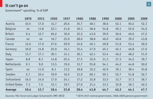
Last Saturday, while reading the last issue of The Economist at home, I found the following table with the evolution of government spending for some countries:

Government spending as % of GDP, source: The Economist

You can see that the trend is upwards for all countries.

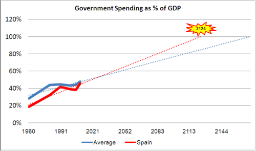
In one of my favourite books, “Augustine’s Laws“, the author goes on extrapolating several trends in the defense and aerospace industry. I did the same with this table for the average of these countries and the particular case of Spain, for obvious reasons.

When will government spending reach 100% of GDP?

Extrapolating the trend, this would occur in Spain  the year 2124 (for the average of the countries in the table it would happen in 2171). What would that mean? By 2124 every euro spent in Spain would be spent by the government (local and central), not a dime spent by individuals. The end of private property.

Government Spending as % of GDP, extrapolation

That is not necessarily worrisome: we would be provided a home by the state, food to eat (the trend doesn’t say whether we would have to eat in public canteens or we would receive vouchers to get stuff from grocery shops), clothing, etc… We would become a kind of communist country in the end. Don’t worry, United States would join us some years later. I guess the last country in joining this pan communist block would be Switzerland, but its time would come, too. No Cold War this time.

In case you wanted to start-up a business, you’d better do it soon: I guess some years before the doomed 2124 it would be prohibited to launch such kind of initiatives. Good luck with your venture! I’ll just look forward to a pleasant and quiet 9-13 position in such an administration. 🙂

Leave a comment

Filed under Economy

Budgets and Gadgets

A couple of Sundays ago I was discussing with my father about Spanish public debt, budget deficits, etc. We both had some figures in mind and I also had some others recorded in the mobile phone, from a conference I had attended at EOI Business School some months before (see the slides below).

Over the table, my father and I were trying to figure out whether the Spanish public debt could reach or not 75% of GDP in two years from now: “given that budget is around 35% of GDP and public debt is around 53% of GDP, then if budget deficit is 12% this would add to the public debt no more than 4% debt over GDP a year”… at that moment I missed having had at hand a detailed view of the Spanish Government Budget of 2010. I wanted to have some TreeMap of the budget like the one I had recently seen from the US 2011 Budget request at The New York Times website.

So I put myself into it. Google docs spreadsheet has among its many gadgets the possibility to draw a Tree Map which is precisely what I wanted to have. First I used some already prepared data from the my job to see how it worked, and, once I saw it was easy, I gathered the data about Spanish Government from the following website (of which I also liked much the way of presenting).

I had seen some treemaps before at the job, but so far not so many outside. So, the main purpose of this post is not to talk about budgets, but to let you know about this gadget which maybe useful in your job. You may see below the gadget I prepared and if you click on it you may see the detailed figures for each one of the chapters, grouped by category.

The one thing I didn’t like much, again, is that WordPress.com is not enabling its users to directly embed this kind of gadgets into the blog… but this has a simple solution that I keep postponing…

4 Comments

Filed under Economy

A different view of the World

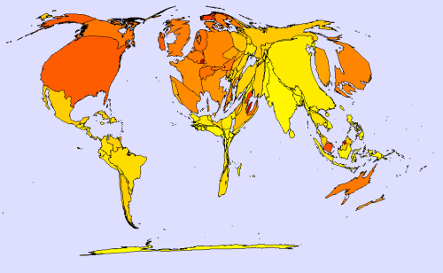
At work I often use different lists of countries by aircraft fleets, GDP, military expenditure, etc. Sometime ago I thought that it would be interesting to produce those kind of maps in which the area of the country represents the value of a variable: cartograms. Surfing through the internet you may find different websites with lots of cartograms to download, explanations about the method to produce them and even some applications that you may use to produce your own cartogram.

Today I have been playing with one of these applications. These are three of the cartograms I made:

  • In the first one: area represents GDP (in purchasing power parity) whereas colour shows GDP per capita (again in PPP).
  • The second one shows: military expenditure (PPP) as the area of countries whereas colour shows military expenditure as a percentage of GDP.
  • The last one has area representing again military expenditure (PPP) and colour showing military expenditure per capita (PPP).

Area showing GDP (PPP); colour showing GDP per capita (PPP).

Area showing Military Expenditure (PPP); colour showing Military Expenditure as percentage of GDP.

Area showing Military Expenditure (PPP); colour showing Military Expenditure per capita (PPP).

The data I used comes from extractions I made from the CIA World FactBook in 2007-2008, which used estimated data of different years, mainly 2006.

The application I used is made by MAPresso, and the quickest explanation on how to work with it I found it in this blog.

1 Comment

Filed under Aerospace & Defence

Aerospace, a high-tech sector in Spain

Two years ago, there was a televised debate prior to the general elections in Spain. I remember I was watching it with friends and the incumbent president said “Spain is the leader country in the technology of air refuelling aircraft”. Since those friends watching the debate with me and I work in the aerospace sector we appreciated the comment.

Many things have happened since them, but one has not changed: aerospace sector is one of the most technologically intense in Spain.

For this post I am using mainly two sources: 2008 annual report from ATECMA (Asociación Española de Constructores de Material Aeroespacial, now replaced by TEDAEAsociación Española de Tecnologías de Defensa, Aeronáutica y Espacio; 2009 report is being cooked) and 2009 report from COTEC (a foundation for technological innovation, “Informe Cotec 2009“).

I already mentioned in a previous post the size of aerospace sector in Spain: 5,577M€ revenues in 2008. In the last 10 years aerospace revenues in Spain have trebled. In 2008 Spanish GDP was about 1,088 bn€, so aerospace sector weighed 0.51% of Spanish economy.

Aerospace sector revenues and R&D evolution.

Regarding the employment, there were 36.160 employees of which over 15,000 were graduates, engineers and managers; 41% of the workforce consists of highly qualified employees. The employment of the sector has been doubled in the last 10 years.

Aerospace sector has presence in 16 regions, with the highest contribution from Madrid (63% of revenues and 57% of employment).

Aerospace sector revenues and employment per region.

There were 335 companies: 6 employing over 1,000 workers and 318 SMEs.

The sector had a positive trade balance of 3.6bn€ (while Spain has a large negative trade balance, of about 100bn$ prior to the crisis, now around 70bn$, 4.5% of GDP).

Aerospace industry is a dual industry: companies involved in it develop both civil and military products. The weight of each depends on the different years, but on average Spanish aerospace industry is 60% civil and 40% military.

After this brief description of some facts (see ATECMA report for a more detailed view of the sector), I want to remark the technological intensity of the sector.

Aerospace sector invests about 10-15% of its revenues in R&D. This is by itself an impressive, figure: Spanish economy as a whole invested in 2007 1.27% in R&D, thus aerospace invests 10 times as much as the economy average. If we said that the weight of the sector was 0.51% of Spanish economy, the aerospace R&D represents 5% of national R&D investments. Even more, if we only count R&D executed by companies, aerospace R&D contributed with 8.5% of total private R&D.

I included in this post the report from COTEC because it makes a distinction among the different sectors dedicated to technology in Spain: manufacturing vs. services, and high technology vs. medium-high. It uses categories derived from INE (Instituto Nacional de Estadística), and there we see 6 sectors classified as “High Technology Manufacturing Sectors”:

  • Pharma
  • Office material and computers equipment
  • Electronics components
  • Radio, TV and communication devices
  • Medical, precision, optics devices and watches
  • Aerospace

R&D investments of high-technology sectors.

Combining the data from this report with data from ATECMA (using 2007 figures for comparison with COTEC), we reach the following findings:

  • Aerospace sector revenues represented 15% of high-tech manufacturing sectors.
  • High-tech manufacturing sectors invested 1.3bn€ in R&D in 2007, this is 4.5% of their revenues, or 10% of total R&D in Spain.
  • Aerospace sector R&D represented 49% of high-tech manufacturing sectors R&D (!).

Indeed, it seems a high-tech sector.

If you wish to compare Spanish A&D with other European countries, please see the ASD reports (AeroSpace and Defence Industries Association of Europe).

1 Comment

Filed under Aerospace & Defence