Monthly Archives: February 2014

Boeing 787 orders, cancellations, deliveries & backlog through 2013

At first sight the year 2013 may seem to have been an annus horribilis for the Boeing 787 program with the months-long grounding of the fleet due to the lithium-ion batteries heat runaway issue, the fires that some of the aircraft in the operating fleet suffered, etc. On the other hand, after 4 years of sales impasse (from 2009 to 2012, inclusive), in which the cumulative net orders of those 4 years stood at a negative 62 aircraft cancelled, in 2013 Boeing recorded 183 new orders against just a single cancellation. Thus, 182 net orders. That is the 3rd best year in sales since the program was launched in 2004.

Last year, I wrote a post wondering whether the grounding of the fleet could be translated into some cancellations. Well, it didn’t so far. Quite the contrary, it got some big contracts from American Airlines, Singapore Airlines, Etihad, British Airways and GECAS.

In last year’s post I included a graphic that I have updated for this post, in order to reflect this recovery and have in one snapshot a view of the orders, cancellations, (net orders), deliveries and backlog.

787 orders, cancellations, deliveries and backlog through 2013.

787 orders, cancellations, deliveries and backlog through 2013.

Leave a comment

Filed under Aerospace & Defence

Our investment fund in 2013

It is 5 years now since Luca and I started investing together. This is the 4th year publishing this post in which I explain how our investments fared along the year (1). In previous years’ post I had explained how we had adopted for our personal investments the same approach mutual open-ended funds have.

Brief recap for newcomers:

As I explained last year, we had to define a net asset value per share (valor liquidativo de la participación) at the beginning of the period. This net asset value per share rises and decreases as the aggregate share prices of the stocks in the portfolio rise or decrease. When an investment fund informs about its yearly results it is referring to the performance of this net asset value per share.

Each time that there is an addition of capital (new investments, in this case by Luca or me) it is treated as an issue of new shares to ourselves. It doesn’t matter that we are the only “shareholders”. Depending on whether the net asset value has increased or decreased we are acquiring the new shares at a higher or lower price than we acquired the previous ones. Exactly as it works in a fund.

Let’s go to this years results: How did the year 2013 go? In line with 2013 good year for stock markets it wasn’t a bad one.

In 2013 we have not been very active investors, not doing many transactions nor adding lots of funds to the investments (with a wedding in sight for mid year and a baby to come we had a preference for cash). We mainly held previous investments and sold a couple of positions which already earned what we expected (2).

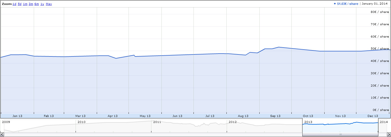
During 2012 I took note of the fund value about 22 times, so we could get an idea of how the fund evolved. As you may see in the graphic below, the net asset value per share at the beginning of 2013 was 44.63€ while at the end it increased to 51.03€, that is +14.34%. That was the performance of the fund in 2013 (not good enough to sell subscriptions to the fund! :-) ).

J&L investment fund performance during 2013.

J&L investment fund performance during 2013.

How does it compare with the main indexes?

  • S&P 500, +29.6% in $ terms [+23.9% in € terms, after taking into account F/X (3)] (this is the target index)
  • Dow Jones, +26.5% in $ terms [+20.9% in €]
  • NASDAQ, +38.2% in $ terms [+32.1% in €]
  • IBEX 35, +21.4% 
  • Euro Stoxx 50, +18%

The gains of the fund since its creation in January 2009 have been+66.51%, with a compounded annual gain of +10.85% (remember this always refers to the net asset value per share – marked by the first 2 positive years – and cash gains cannot be directly derived from the net asset value performance times the total assets).

Two years ago, I introduced the comparison with leading Spanish value investing fund managers from Bestinver (4). Let’s do the exercise again:

  • Bestinfond, +31.82%;
  • Bestinver Internacional, +32.54%;
  • Bestinver Bolsa, +29.72%.

All in all, 2013 has been a good year to present results, though it would had been even better if we had a bigger stake in Bestinver ;-).

I’ll keep you informed next year of this year’s results.

—–

(1) See previous posts showing 2012, 2011 and 2010 results.

(2) Unhappily among others we are not any longer shareholders of Metlife (will miss the iconic view of its landmark building in NY) and GE (will miss the good feeling when seeing a GE truck anywhere)…

(3) Since our investments account is based in the Euro zone, it is important to take into account dollar-euro exchange fluctuations for good and bad. Take a look at this website for interesting graphics, perpe. The USD gained 4.70% against the EURO in 2013 (or the EURO lost a 4.49%)

(4) Disclaimer: Since sometime in 2011, we have also positions in Bestinver, though I don’t get any fees for promoting it in the blog. (Our positions with Bestinver are excluded from the calculations of “J&L” fund to allow for clean comparisons).

NOTE: “J&L fund” numbers are pre-tax of capital gains realized, include dividends (twice taxed) and are net of transaction costs & brokerage commissions.

Leave a comment

Filed under Investing

A380 sales compared to 747 sales at program start (update 2013)

In the previous post I briefly discussed aviation analyst Richard Aboulafia’s assertion “Airbus will be paying the price for the A380 for many years to come” (see original article) from a purely financial and accounting point of view. In this post I wanted to look at it from the market point of view. To do that I will update with 2013 figures a couple of tables and graphics I built last year comparing A380 and 747 orders at each programme start (see last year’s post here).

First see in the graphic below A380 orders since the programme launch (2001) in comparison to those of the 747 (1966):

A380 and 747 orders referenced to the year of launch of each programme (up to 2013).

A380 and 747 orders referenced to the year of launch of each programme (up to 2013).

Both programmes show an initial sales rush at the time of programme launch. In both cases the rhythm of sales slowed down after the second year. In the first 13 years of program, each had managed:

  • 747: 433 orders.
  • A380: 304 orders (30% less).

Thus, we can see that the Boeing 747 was selling better already from the beginning of the programme.

I include again yet another comparison: aircraft orders taking as reference the year of first delivery, having heard so often the industry mantra that some potential customers would wait to see the aircraft in operation before placing orders. See below this second comparison:

A380 and 747 orders referenced to the year the 1st aircraft delivery of each programme (up to 2013).

A380 and 747 orders referenced to the year the 1st aircraft delivery of each programme (up to 2013).

In this case, and due to the shorter time to develop the Boeing 747 since program launch (1966), the difference in sales is narrowed:

  •  747: 301 orders.
  • A380: 304 orders (about the same).

You can see that, 6 years after the 1st delivery of each aircraft (2007 for the A380 and 1969 for the 747) the A380 and the 747 have sold about the same number of aircraft (thanks, no doubt, to the large recurring order placed at the fall by Emirates).

Boeing 747. The Boeing 747 was the first wide-body in commercial aircraft history and still is the twin-aisle with the highest amount of aircraft sold (1,537 a/c as of today, probably to be soon overtaken by the 777) and delivered (1,482 a/c as of today). However, it has taken over 40 years to reach those numbers. The 1,000th unit sold was reached after 25 years of sales in 1990. The 1,000th unit delivered was also reached after 25 years of aircraft deliveries, in 1993.

Thus, in my opinion, when we want to measure the success of the A380 we cannot be distracted by the figures of other commercial aviation segments (single-aisle and small / intermediate twin-aisle) but we have to check what the 20-year forecasts for the Very Large Aircraft say:

  • ~1,300 aircraft according to Airbus GMF,
  • ~600 aircraft according to Boeing CMO,

and then see what could be expected market share for the A380 against those forecasts and whether it is getting the orders to reach it or not.

Finally, as a reader (Matt B.) of the blog pointed in the comment section in last year’s post:  wide-body market has evolved from the 1970s till today, when there are several competitors and other programmes such as the A330 or the 777 deliver close to 100 airplanes per year.

You can find orders and deliveries figures in both manufacturers websites or summarized here: A380 and 747.

1 Comment

Filed under Aerospace & Defence

A380: “one-off items” versus “accounting block”

Aviation analyst Richard Aboulafia recently published an opinion article at Aviation Week & Space Technology magazine, Airbus Twin-Aisles—Big Needs, Limited Means, in which he discussed strategic product portfolio options for Airbus. He was particularly critical to the A380. Let me bring a couple of passages from the article:

Historically, Airbus has spent more than Boeing on development as a percent of sales than. But during the past 15 years, the bulk of this heavy spending was squandered on the A380. Today, development spending is set to fall in line with the company’s new direction. Last year, it fell below 6% for the first time since the company was established (see graph). Given the requirements of funding the A350XWB and A320neo, Airbus isn’t likely to have the resources to fund both an A330neo and A380neo and a new large twin, too. Tough choices will need to be made. […]

In short, Airbus will be paying the price for the A380 for many years to come.

From these 2 paragraphs, the first assertions are factual: Airbus spends more on research and development than Boeing Commercial Airplanes and during the last years most of that spending was dedicated to the A380. In my opinion the last sentence overstates the issue of the current burden of A380 over the company’s future. If the A380 did not derail EADS during 2006-2010 it will not do so in the coming years. As numbers show and top management has indicated at investors events the A380 programme is expected “to emerge from the red by 2015“.

A380 MSN4 (credit: A. Doumenjou).

Today the A380 is a recurring cost issue, not more. The situation would be entirely different had Airbus (or rather EADS, now Airbus Group) applied the same accounting system that Boeing does (since the merger with McDonnell Douglas). EADS has passed in the profit and loss accounts in the previous years several one-off items related to the A380 valued in billions of euros (refer to yearly financial reports). What is left are R&D (mainly D) expenses to bring down unitary recurring costs and producing enough numbers of aircraft so that learning curve effects can be benefited from.

On the other hand, Boeing accounting system spreads the capital expenditures and research and development costs along what they refer to as an accounting block, which for example for the 787 now takes 1,300 airplanes to amortize those costs (previously were 1,100, see here a post on the 787 break even).

2 Comments

Filed under Aerospace & Defence

Boeing list prices increases vs. discounts increases…

In a previous post I updated the estimate of what is the average discount Boeing applies when selling its commercial airplanes using 2013 data of list prices, deliveries and reported revenues. The figure I came up with was a 47% discount. I included the following graphic showing the discount evolution:

Boeing Average Discount Evolution, 2013.

Boeing Average Discount Evolution, 2013.

Seeing the increasing trend of average discount together with knowing the fact that Boeing regularly increases list prices triggered the following question: Have Boeing airplane real prices increased, decreased or stayed constant in the recent years? I set out to answer this question using the estimated average discount of each year (1) from the graphic above.

The Boeing list prices (LP) can be found here. I have been recording those prices for years and thus have a table with the evolution of list prices for each model year by year. The following step is to apply the average discount estimated for each year to then-year list prices, to get the estimated discounted prices (EDP) per model. Thus, a table can be built for the last 5 years.

You can find below the result for the best-selling aircraft during previous years: 737-800, 737-900ER, 777-300ER and 787-8. Together these 4 models amounted 560 deliveries in 2013 or over 86% of the total 648 airplanes Boeing delivered in 2013.

Boeing List and discount Prices evolution table, 2008-2013.

Boeing List and discount Prices evolution table, 2008-2013.

In the table above I included in black figures what have been Boeing list prices of these models in the past years (as reported in their website) while I marked in blue the figures which are estimated, using as a departure point the calculated averages discounts per year (also included in blue in the table). I included as well the list prices year-on-year change as a % of the previous year list prices, per model.

The average list price increase included at the bottom line is computed with the information of all Boeing models (19 in 2008 and 18 in 2013, though different ones, a total of 24 different models along this period), not only the 4 included in this table.

You may see in the table above that after not increasing prices in 2009, Boeing has steadily increased them in 2010 (6.3%), 2011 (4.7%), 2012 (6.7%) and 2013 (1.9%). However, if you take a look at the blue figures in the same table you will notice that prices of 2013 are between 2008 and 2010 price levels for all 4 models! That is, the widely announced yearly list prices increase has been yearly offset by a discreet (not-announced) increase in the discounts applied to sales of airplanes. Thus, the pricing power of Boeing has remained barely constant during the last 5 years. You may see it better in the graphic below:

Boeing List and discount Prices evolution graphic, 2008-2013.

Boeing List and discount Prices evolution graphic, 2008-2013.

The graphic shows the price evolution for each of the 4 airplane models selected, taking as a reference their list and estimated discounted prices in 2008 (indicated as 100%) . List prices are shown with straight lines, versus dashed lines used for estimated prices. Each pair of prices for each aircraft is presented in the same color for easier identification. Some comments to the graphic:

  • Through continuous increases, 2013 list prices were between 18% (737 and 777) and 27% (for the 787) higher than in 2008.
  • However, due to increasing discounts from 38% in 2008 to 47% in 2013, the increase in list prices is almost entirely offset.
  • 2013 discounted prices are below 2010 discounted prices for all models.
  • 2013 discounted prices are almost back at 2008 levels for the 737 and 777, only the 787 seems to have stayed at 2010 levels.

(1) There is no way to know the real price and discount that Boeing applies in each sale, as it will depend from customer to customer (American Airlines -AMR- or Fedex) and from model to model (737-800 or 787-8). There where competition is tougher, discounts will be higher. However, the estimates I have made are an average of all Boeing aircraft sold in a given year.

3 Comments

Filed under Aerospace & Defence

Weapons of mass miscommunication

With the advent of the Internet, the email has become one of the main ways of communication both in personal and professional environments. I won’t deny the simplicity of conveying ideas, instructions, files, etc., in an email. However, I have often referred to emails as weapons of mass miscommunication.

What do I have in mind when I state that? Emails that need several clarifications, wrong interpretation of emails either or both in the spirit and the letter, emails that go unnoticed, emails that waste reading time of too many people, etc.

While reading “Seeking Wisdom: From Darwin to Munger”, by Peter Bevelin, I thought of another good weak point of emails when reflecting on the following passage on the disadvantages of scale in large institutions:

[…] as you get big, you get the bureaucracy. And with the bureaucracy comes the territoriality which is again grounded in human nature. And the incentives are perverse. For example, if you worked in AT&T in my day, it was a great bureaucracy. Who in the hell was really thinking about the shareholder or anything else? And in a bureaucracy, you think the work is done when it goes out of your in-basket into somebody else’s in-basket. But, of course, it isn’t. It’s not done until AT&T delivers what it’s supposed to deliver. […]

(excerpt from the Lecture by Charles T. Munger to the students of Professor Guilford Babcock at the University of Southern California School of Business on April 14, 1994)

SendThink back of emails and how often we may think that some piece of work is completed when we have clicked on the “Send” button. But it’s not. Not only the work might not be done, but the communication might not even have taken place even if we think so. And it will not happen until the receiver at the other end of the channel has gotten the message and gone through it. Then, the above-mentioned criticism to emails apply (unclear message, clarifications, wrong interpretations…). Thus, no matter how much effort it costs to us breaking the inertia and comfort of our quiet work place, it is much better to accompany an email with a quick immediate follow-up phone call ensuring that the communication actually happens and explaining what is expected from the receiver.

1 Comment

Filed under Books, Personal development & HR

Boeing commercial aircraft discounts (update for 2013)

Few days ago, Boeing released 2013 results [PDF, 841KB]. The company reported revenues of over 86.6bn$648 commercial deliveries and 1,355 net orders for its commercial aircraft. All these were widely reported by the media and mean a great year 2013 for Boeing (with increases in these metrics from 6 to 8%).

Last years, I wrote in some posts (1) what was my estimate of Boeing discounts: the relation between what is announced by the press, what appears in its list prices and sometimes as backlogs and what it is indeed computed into the profit and loss account. In this post I wanted to update, if necessary, the figure I calculated for the average discount of Boeing.

Most of the necessary information can be found in its website. Boeing list prices can be found here.

The number of gross and net orders (after cancellations) year by year can be found here.

Last year deliveries can be found in the report of financial results (or here). From there we can also deduce the figure of Boeing Commercial’s sales of services. That is not directly reported but can be deduced (all Boeing services-related sales are reported as well as Boeing Capital Corporation division and Boeing Defense’s “Global Services & Support” unit)

As in the previous years’ post:

  • I needed to make one assumption: new orders come with a 3% down payment in the year of the booking, while the remaining cost I assumed that was paid on the year of delivery (for simplicity I didn’t consider more intermediate revenue recognition milestones linked to payments, the 3% figure was taken from the AIAA paper “A Hierarchical Aircraft Life Cycle Cost Analysis Model” by William J. Marx et al.). (2)

Having put all the figures together, the calculation is immediate. Boeing Commercial Aircraft revenues in 2013 (52.98bn$) are the sum of:

  • the discounted prices times the delivered aircraft in the year (including possible penalties from delays),
  • less the down payment of the current year delivered aircraft, as the down payment was included in previous years results,
  • plus the down payment of current year net orders (this year’s calculation has been again a bit tricky as it included 737NG deliveries and 737 MAX orders),
  • plus services revenues (less than 0.3bn$ from the commercial aircraft unit – calculated, not reported).

The discount figure that minimized errors last year was 45%. Using this figure, the error obtained this year in relation to Boeing Commercial Aircraft reported revenues is 3.9%, much too high. The best estimate for last years average discounts were: 45% for 2012, 41% for 2011, 39% for 2010 and 38% for 2009.

The updated figure (which minimize errors for 2013 down to 0.2%) for the discount for Boeing commercial aircraft is 47% (3).

Boeing Average Discount Evolution, 2013.

Boeing Average Discount Evolution, 2013.

The explanation I can find for that increase shall be linked the built-in penalties for 787 plus the introduction of the new 787-10 with increased discounts for the launch customers.

(1) Find here what is becoming a “body of knowledge” on Boeing discounts: estimates calculated for 2012, 2011, 2010 and 2009; a review of the French portal Challenges.fr of aircraft discounts prior to Le Bourget airshow of 2013; a Bombardier’s CEO statement on what is known in the market as the Boeing discount; Boeing Commercial Airplanes president Ray Conner speaking about the more aggressive pricing they are being forced to offer.

(2) Two years ago, I received a comment from the analyst Scott Hamilton on the level of downpayments. He mentioned they could reach up to 30%. I tried this time to compute the calculation using that input, though the figures of discounts to be applied each year to minimize errors would have to be even higher, over 50% (!), thus I stayed with the 3% used in the above-mentioned published paper to stay on the conservative side.

(3) I find this trend of continuous increases in Boeing discounts in line with both Challenges.fr report and Ray Conner’s mentions of aggressive pricing last year, both referred to in note (1).

10 Comments

Filed under Aerospace & Defence

Bean counters turned risk managers

In a previous post I wrote about the Titanic as an example of disaster of project management, drawing from a conference I attended.

At the end of the post I reminded the theory of safety in systems seen as layers of cheese with some holes in them. The speaker did not enter into risk management, but rather in communication, teamwork and leadership, nevertheless she acknowledged the side of risk management to the case.

"What management is", by Joan Magretta.

“What management is”, by Joan Magretta.

While reading the book “What management is”, by Joan Magretta, I recently came across the case of the Ford Pinto which I did not know:

In the 1970s, the Ford Pinto taught the nation the basics of cost-benefit analysis. The car had a design flaw in the gas tank that caused at least fifty-nine deaths. Rubber liners would have fixed the problem at a cost of $137 million. But careful calculations of the benefits – all costs associated with those burned and killed down to the flowers at the funeral – only added up to $49.5 million. Cost-benefit analysis said it just didn’t pay to redesign the Pinto. The lesson at the time seemed pretty clear, and many baby boomers grew up suspicious about management and its methods. […] (excerpt from “What management is”)

You may see in the article of the Wikipedia here more references to the case, including an apparently famous article at the time, Pinto Madness, which appeared in the Mother Jones magazine. Some excerpts from that article:

Because assembly-line machinery was already tooled when engineers found this defect, top Ford officials decided to manufacture the car anyway […]

For more than eight years afterwards, Ford successfully lobbied, with extraordinary vigor and some blatant lies, against a key government safety standard that would have forced the company to change the Pinto’s fire-prone gas tank. […]

Ford waited eight years because its internal “cost-benefit analysis,” which places a dollar value on human life, said it wasn’t profitable to make the changes sooner. […]

I place myself the same question again: Have we progressed since then?

And again: Today we like to think that yes. More requirements regarding safety are put into projects. Regulations are passed to ensure safety. Risk management is used as part of project management to ensure that the kind of decisions taken at the time of the Ford Pinto today they are taken without overlooking the risks behind them.

However, I wanted to remark this time the need and criticality of placing safety at the driving seat of cost-benefit analysis, of evaluating risks and mitigations, budget reductions, targets setting, etc. As Charles Munger uses to say all these frameworks and mental models together may create a lollapalloza effect, that is the confluence of incentives and biases acting together may result in the overlooking of serious risks which down the road (after the fact) would seem impossible to have been overlooked (as in the cases of the Titanic or the Ford Pinto).

I believe this takes the utmost importance especially in an industry like aerospace, where the words “safety first” cannot be just a phony industry mantra.

3 Comments

Filed under Books

Time Value of Money

In courses about finance in the past, as part of job-related investment projections, for personal investments and as part of exercises related to posts in this blog I have discounted cash flows several times. Discounted? To those not initiated: it is about the time value of money.

Many course of finance start with the explanation of time value of money. You can find Wikipedia’s article here.

I recently came across the most descriptive and ancient (to my knowledge) explanation of the concept.

A bird in a hand is worth two in the bush”, Aesop, 600 B.C.

Seeking Wisdom: From Darwin to Munger, Peter Bevelin.

Seeking Wisdom: From Darwin to Munger, Peter Bevelin.

I found it while reading “Seeking Wisdom: From Darwin to Munger”, by Peter Bevelin, in which the author retrieved a passage from Warren Buffett’s 2000 Letter to the Shareholders of Berkshire Hathaway [PDF, 93KB, pg. 13]

Leaving aside tax factors, the formula we use for evaluating stocks and businesses is identical. Indeed, the formula for valuing all assets that are purchased for financial gain has been unchanged since it was first laid out by a very smart man in about 600 B.C. (though he wasn’t smart enough to know it was 600 B.C.).

The oracle was Aesop and his enduring, though somewhat incomplete, investment insight was “a bird in the hand is worth two in the bush.” To flesh out this principle, you must answer only three questions. How certain are you that there are indeed birds in the bush? When will they emerge and how many will there be? What is the risk-free interest rate (which we consider to be the yield on long-term U.S. bonds)? If you can answer these three questions, you will know the maximum value of the bush ¾ and the maximum number of the birds you now possess that should be offered for it. And, of course, don’t literally think birds. Think dollars.

Aesop’s investment axiom, thus expanded and converted into dollars, is immutable. It applies to outlays for farms, oil royalties, bonds, stocks, lottery tickets, and manufacturing plants. And neither the advent of the steam engine, the harnessing of electricity nor the creation of the automobile changed the formula one iota — nor will the Internet. Just insert the correct numbers, and you can rank the attractiveness of all possible uses of capital throughout the universe.

Leave a comment

Filed under Books, Investing

Penosa encuesta de Metroscopia

Me encuentro hoy en El País con la siguiente encuesta “Autoubicación ideológica de los electores”:

Fuente: Metroscopia para El Pais,

Fuente: Metroscopia para El Pais,

Dicha encuesta va acompañada de un artículo (“¿Hay espacio más allá?”) firmado por Jose Pablo Ferrándiz, sociólogo y vicepresidente de Metroscopia. Y por lo que parece, mal profesional.

Viendo la encuesta me llama la atención que indiquen que hay 342.967 electores de extrema derecha (10), los mismos que prácticamente extrema izquierda (1) o derecha (9). Miro en detalle los números y veo que han preguntado exactamente a 100 personas.

La encuesta indica que la población de electores es de algo más de 34 millones de personas. Me llama la atención lo pequeño de la muestra, y me pregunto por la confianza de la muestra que han tomado, y así que se lo pregunto

Como no espero respuesta, decido hacer los números.

[Por cierto, cuando digo arriba “mal profesional”, en parte lo digo porque ya es poco profesional no adjuntar los datos de la muestra: número de encuestados, nivel de confianza e intervalo de confianza… pero veremos que no los incluye por algo]

Usando un simple calculador podéis ver que para un nivel de confianza típico de entre 95% y 99% con una población de más de 34 millones de electores, el hecho de haber cogido una muestra de solo 100 personas hace que el intervalo de confianza esté entre + / – 10-13%.

Es decir, lo que Jose Pablo no nos dice es “un 10% de los electores se ubica en el centro derecha (6) con un intervalo de confianza de más o menos 10%, podrían ser 0% o 20%, vaya usted a saber. Esa es la frase que echo en falta en su artículo donde llega hasta el punto de desgranar como se califica un 2% o 6% de la población (más menos 10%...)

El último detalle que me ha encantado es la nota del final: “* La diferencia hasta 100% corresponde a no sabe y a no contesta”. Lo gracioso es que las cifras de porcentajes que han dado sí que suman 100%, y por tanto la nota final sobra. Todo el mundo ha contestado y el único que no sabe aquí es Jose Pablo.

¿A quién debemos poner en solfa? ¿A El País? ¿A Metroscopia? ¿A su vicepresidente Jose Pablo Ferrándiz? ¿Al becario? ¿…?

NOTA: Al final dudo de si con los 100 encuestados se han limitado a preguntar a “electores” y aleatoriamente. Capaces de haber preguntado a menores de edad, extranjeros, y solo a familiares y amigos…

1 Comment

Filed under Miscellanea, Twitter & Media